
Branding · Social Media
Verve Coffee Co.
Building a coffee brand around the one thing every other bag on the shelf hides in six-point type: the day it was roasted.
- Sector
- Speciality Coffee
- Disciplines
- Brand, Social
- Scope
- 9 Weeks
- Deliverables
- 28 Assets
Small-batch roasters · Bristol
Roasted Tuesday.
Yours Thursday.
We roast once a week, to order. Nothing sits in a warehouse waiting for you to want it.
Order this week's roastOff the roaster this week
All coffeeMedium
Weekday
Weekday · 250g
£11.50
Light
Bright
Hours
Bright Hours · 250g
£13.00
Dark
Late Shift
Late Shift · 250g
£11.50
Roastery homepage — desktop, 1440px
Overview
Verve roasts well. On a shelf of forty bags, nobody could tell.
Verve Coffee Co. is a self-initiated concept project — a fictional small-batch roaster we built to work through a problem that shows up in almost every craft-food brief: a category where every producer has converged on the same visual answer, so quality stops being visible at the exact moment someone is choosing.
We ran it as a full brand engagement: category audit, positioning, verbal identity, logo and colour system, a four-SKU packaging range, applied retail, and a social content system with rules a two-person team could follow without a designer on call.
The identity work on this page — the mark, the label hierarchy, the bag faces, the signage and the phone screens — is drawn in HTML, CSS, and SVG, so every specification stays live and editable rather than flattened into a picture. The photographs show the same system as it would arrive in the world.
The Challenge
The whole category agreed on the same bag.
We audited thirty-one speciality roasters sold through independent grocers. Twenty-six used kraft or matte black. Nineteen used a hand-drawn illustration of a mountain, a bird, or a plant. Almost all of them led with origin: the farm, the altitude, the varietal, the process. It is genuinely interesting information and it is completely undifferentiating, because everyone has it.
The second problem was social. The feed was one product photo per post, published whenever someone remembered, with captions written in the reverent tasting-note register the whole category shares. There was nothing to follow between purchases and no reason to look at the grid as a whole — which is how Instagram actually gets read.
Kraft, a small centred illustration, and origin copy at 7pt. Cover the logos and nothing changes.
Weekday
Bright
Late Shift
Roast level carried by colour, blend name set large, and a date you can read from the middle of the aisle.
Positioning & Voice
We stopped selling the farm and started selling the date.
Origin is the category's shared language, so it can't be anyone's position. Freshness can be. Verve roasts one day a week, to order, and ships within forty-eight hours — a real operational constraint that most roasters treat as a logistics detail and print on the back in grey.
We made it the entire brand. The roast date became the hero on the pack, the site's headline, the reason the social calendar has a shape, and the thing every piece of copy is allowed to promise. It is checkable, it is specific, and it is the one claim a supermarket own-brand structurally cannot make.
Positioning statement
For people who make coffee at home four mornings out of five, Verve is the roaster whose coffee is never more than a week old — because we roast to order and print the date larger than the origin.
Everything downstream has to be defensible against that sentence. A design decision that makes the date smaller is wrong by definition, however nice it looks.
Date over origin
Roast date sits in the top third of every pack, at the same optical weight as the blend name.
A week, not a season
The brand runs on a seven-day cycle rather than seasonal drops, so there is always something true to say.
Warm, not reverent
Speciality coffee's default tone is priestly. Verve sounds like the person who hands you the cup.
Verbal identity
Three rules, written so a founder answering DMs at 7am can apply them without thinking: say the number, describe the cup, not the journey, and give the instruction, skip the ceremony. Below, the same three ideas written on brand and off.
“Roasted Tuesday. In your cupboard Thursday.”
“Embark on a sensory journey through the terroir of Huila.”
The promise is a date, not a destination. Lead with the part the customer can check against the calendar on their phone.
“Sweet and heavy. It takes milk without disappearing.”
“An exquisite, velvety cup of unparalleled depth and character.”
Describe what the coffee does in the cup someone is actually about to make. Adjectives that fit every coffee describe none of them.
“Tastes sharp? Grind one notch finer and pull it again.”
“Unlock the full potential of your morning brewing ritual.”
The brand knows more than the reader and isn't smug about it. One instruction, one outcome, no ceremony around either.
Identity System
A V that keeps going after it should have stopped.
The mark had two jobs: read as a cup and read as a rise. Both arms of the V are straight lines drawn on the same construction grid, but the right arm doesn't terminate at the cap line — it carries on and curls over the top, landing exactly on the crown of the smallest guide circle. Verve, the word, means energy that carries. The mark does the same thing literally.
We resisted the bean. Every roaster within four miles of this brief uses one, and a silhouette that generic can't do identification work at profile-picture size.
The vertex sits on the baseline so the mark can be optically centred against a cap-height wordmark without a manual nudge. The curl terminates on the axis, which gives the lockup a clear top edge to align signage and label artwork against.
Rules for the mark
Clear space
Half the mark's height on every side. Nothing enters it, including the wordmark.
Minimum size
Strokes thicken as it shrinks. Under 16px the curl is dropped and the V stands alone.
Never distort
The arm angle is the identity. Stretched to fit a banner, it stops being the mark.
No effects, no off-palette
Two flat colours from the palette. No shadows, bevels, or seasonal recolours.
Colour
Four of these six do a second job on pack: Crema is light roast, Ember is medium, Espresso is dark, Paper is decaf. Once colour is carrying roast level, the range is navigable from three metres away and Silt is left to handle small print only.
Typography
One display family across the whole system, differentiated by weight and tracking rather than by adding faces. The date stamp is the only place bold appears, which is what makes it read as a stamp rather than a heading.
Packaging & Retail
Four bags that name a time of day.
Blends are usually named after places or moods. Verve names them after when you'd drink them, which makes the range self-explaining at the shelf and gives the brand a natural excuse to talk about days of the week — the same rhythm the roast date already set up.
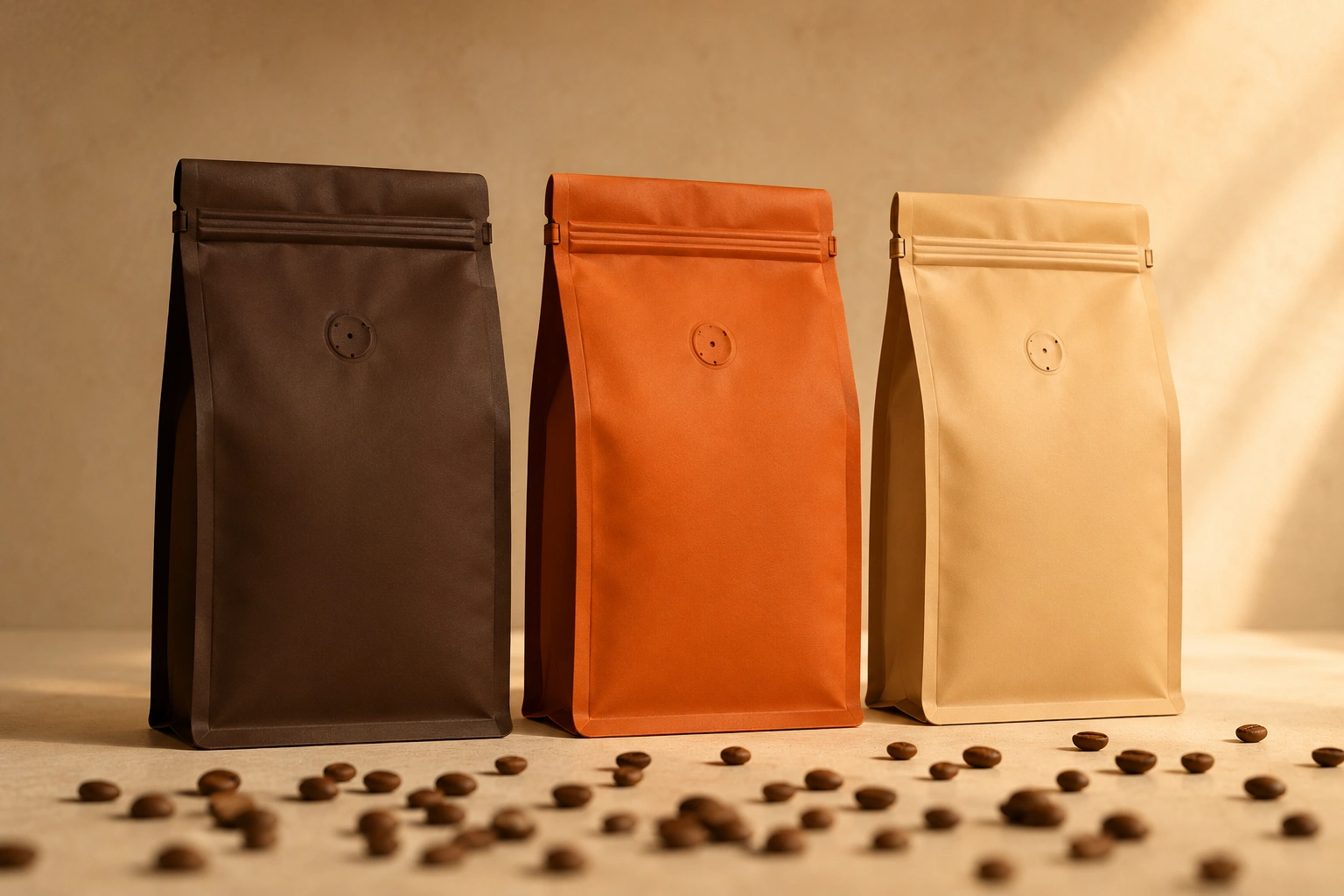
Roast level is carried entirely by the bag colour, so a customer can learn the system once and then shop it from a distance. The only decoration is the gusset shadow, which is structural rather than drawn.
Light roast
Bright
Hours
Ethiopia Guji · Washed
Peach · Jasmine · Lemon peel
Crema. Filter-only, and the bag says so before the label does.
Medium roast
Weekday
Brazil Cerrado + Colombia Huila
Cocoa · Toasted almond · Brown sugar
Ember. The house blend, and the bag most likely to be seen from across a shop.
Dark roast
Late Shift
Sumatra Aceh + Guatemala Huehue
Dark chocolate · Molasses · Walnut
Espresso. The only pack where the mark inverts to Ember, so it survives the dark ground.
Decaf · Medium
Half Past
Nine
Colombia Huila · Sugarcane
Red apple · Praline · Malt
Paper. Decaf gets the quietest bag rather than an apologetic one.
Label hierarchy, set by reading distance
Rather than argue about what matters most, we specified the distance each element has to survive. Anything that only needs to work in the hand goes to 6pt and stops competing.
Off the shelf and into the room
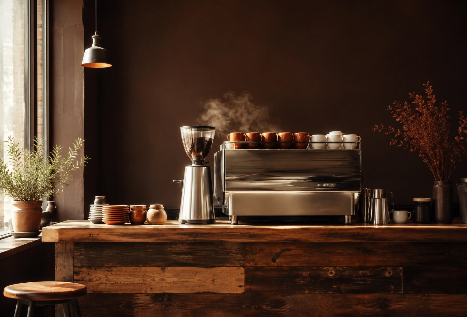
The café is where the brand gets tested at real scale. Same four colours, same one display family, same rule about the date — printed on the board so the counter has to keep it honest.
12oz takeaway. The band sits at the height a hand doesn't cover.
Today
Menu board. The date is printed, not chalked, so it can't quietly go stale.
Fascia and window vinyl. The awning stripe is the only pattern in the system.
The Result
A brand that holds up on a shelf, in a hand, and at 110 pixels square.
One claim, everywhere
The roast date runs from the pack to the menu board to the caption formula, so every surface argues the same point.
A range you can read fast
Four colours doing the roast-level work means the shelf is navigable before a single word is read.
A feed a small team can run
Three tile types, a set of three per week, and two days off — a system that survives a busy month.
What you won't find on this page. Verve doesn't exist, so it has no followers, no shelf, no stockists, and no sales — and a made-up growth percentage would tell you something about our copywriting rather than our design. The dates, prices, and origins above are set dressing for a concept range. What's real is the work itself: the strategy, the mark and its rules, the packaging system, and the content model. On a paid engagement, those are the things we'd put our name to, and the results would be measured by the client, not written by us.
Social System
The grid is the composition. The post is just a tile in it.
A profile is read as a nine-tile block before any single post is read as a post. So we designed the block, not the posts — three tile types, and a rule that means the block can never fall apart no matter how long the brand keeps going.
The rule is: you never post one thing, you post a set of three — one product tile, one typographic tile, one texture tile, published together on roast day. That keeps every row complete. The set then rotates its internal order each week, which pushes the three types onto a diagonal, so no column ever fills up with the same thing.
Roasted
TypeTuesday.
One notch
Typefiner.
Decaf isn't
Typea compromise.
Nine-tile view — each row and each column carries exactly one of each type
Product
A bag, a cup, or the range lined up — always flat on Paper, always centred, never a lifestyle shot with a hand in it.
Typographic
One sentence in the brand's voice, set in Display 500, maximum six words. If it needs a seventh it belongs in the caption.
Texture
Beans, crema rings, steam. No message, no product — it exists to give the eye a rest so the other two tiles land.
The rotation
Week one posts Product, Type, Texture. Week two starts on Texture. Week three starts on Type. Then it repeats. Three weeks of posts and the diagonal appears on its own.
A week that plans itself
The roast cycle is the editorial calendar. Nobody has to invent a content idea on a Sunday night, because the week already has a shape and two of the days are deliberately empty.
Mon
Green in, week planned
Tue
Roast day. The grid moves
Wed
Grind clinic, 6pm cut-off
Thu
Bags land. Answer everyone
Fri
Café story if there is one
Sat
Nothing
Sun
Nothing, deliberately
In the app, not in a moodboard
Roasted
Tuesday.
vervecoffee Weekday is off the roaster. Cocoa, toasted almond, brown sugar. Order by 6pm tomorrow and it's in your cupboard Thursday.
2 hours ago
Grind clinic
Sharp and
thin?
Go one notch finer. Same dose, same time. Try it once before you change anything else.
What's yours doing?
Verve Coffee Co.
Small-batch roasters · Bristol
Roast day is Tuesday. Order by 6pm Wednesday, it's with you Thursday.
Tuesday.
finer.
compromise.
Feed post, roast-week story, and the profile as a customer first sees it. The story slot is where the brand does its most useful work — one small piece of brewing help a week, in the voice, with no product in shot.
Three templates, no decisions
One layout per tile type, locked. Making a post means choosing a photograph-free composition and typing a sentence.
A caption formula
What it is, what it tastes like, when it arrives. Three clauses, in that order, every time — so the voice survives whoever is posting.
A texture bank
Twelve pre-built texture tiles delivered with the system, so the third slot in every set is never the reason a week gets skipped.