Branding · Web Design & Development
Lumen
Turning a thirty-year-old retail name into a digital-first brand people find before they ever walk past a store.
- Sector
- Retail
- Disciplines
- Brand, Web
- Scope
- 12 Weeks
- Deliverables
- 14 Assets
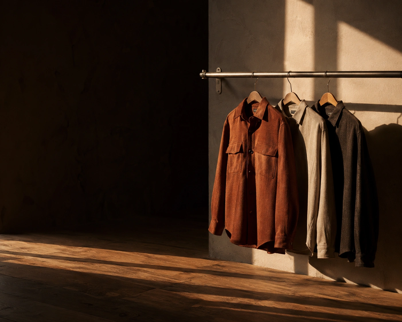
Autumn / Winter
Made to be
kept.
Thirty years of considered manufacture, now in one place.
Shop the collectionSelected pieces
View all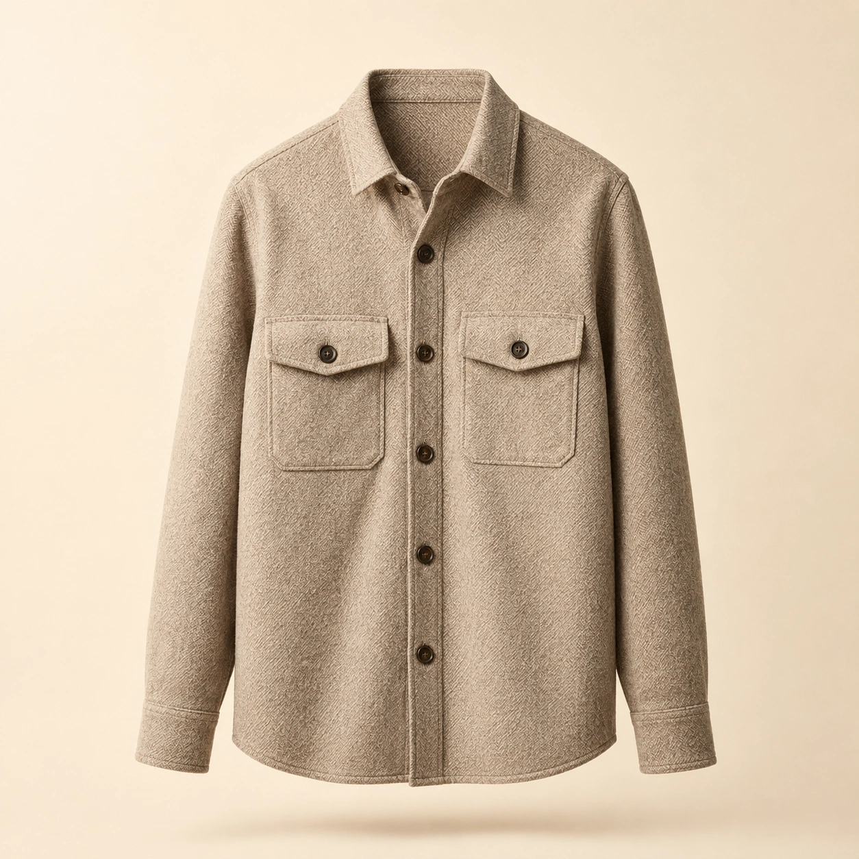
Wool Overshirt
£185
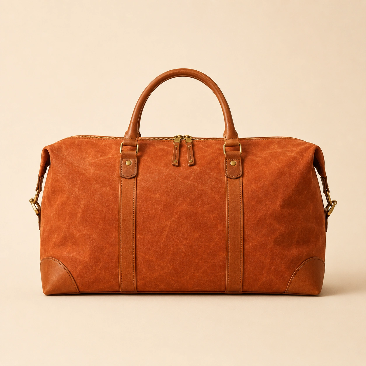
Canvas Weekender
£240
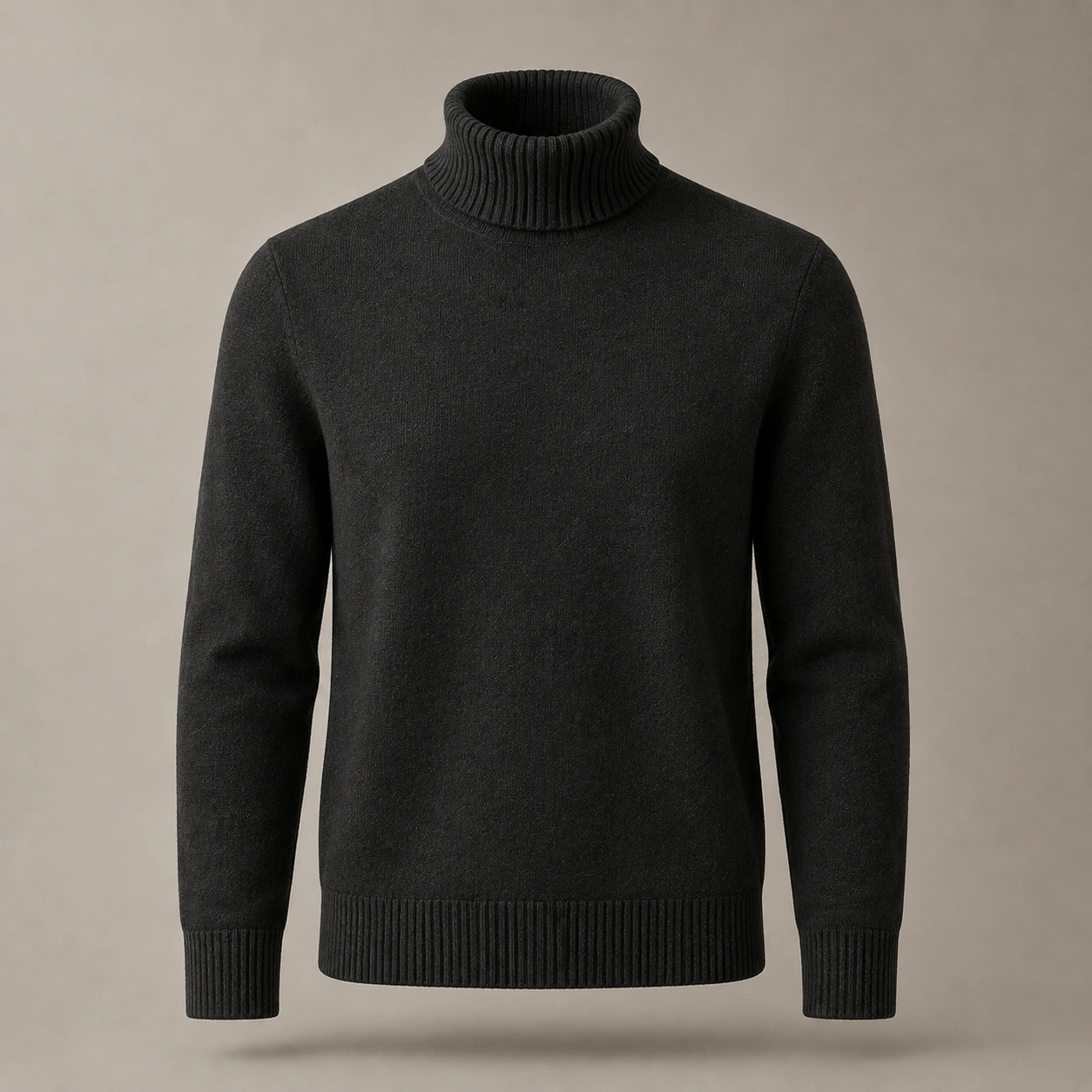
Merino Roll Neck
£120
Storefront homepage — desktop, 1440px
Overview
Lumen had thirty years of goodwill and none of it was visible online.
Lumen is a self-initiated concept project — a fictional heritage retailer built to work through a problem we see constantly in real briefs: a business whose reputation was earned in physical space, arriving late to a market that judges it on a phone screen.
We treated it as a full engagement: research, positioning, identity, design system, and a production-grade commerce front end. Everything on this page was designed and built for the project.
The Challenge
One brand, told three different ways.
The identity had accumulated rather than evolved — a logo refresh here, a signage update there, each decision reasonable on its own and incoherent in aggregate. Three storefronts used three different logo weights. The website used a fourth.
Underneath the visual problem sat a structural one. The commerce experience had been bolted onto a brochure site, so the moment a customer moved from browsing to buying, the brand fell away and a generic checkout took over. Trust built over three decades was being spent at exactly the wrong moment.
Dense, undifferentiated, four competing logo treatments in one viewport.
Made to be kept.
Autumn / Winter
One mark, one voice, generous space — the product does the talking.
The Approach
We started with strategy, not screens.
Before any visual work, we mapped where the old brand was losing people. The pattern was consistent: customers arrived with intent, hesitated at the point where the experience stopped feeling considered, and left. Three principles came out of that, and every later decision was tested against them.
Clarity over decoration
If an element didn't help someone choose, it didn't ship.
Consistency at every touchpoint
One system covering signage, packaging, web, and checkout.
Commerce designed in
Checkout treated as brand surface, not a third-party afterthought.
Identity System
A mark built from the light it's named after.
The counter-form of the L holds a fixed point of light — a constant across a wordmark that otherwise sits quietly behind the product.
Colour
Ink and Paper carry roughly 90% of every layout. Terracotta is reserved for a single action per screen, which is what keeps it meaning something.
Off the screen
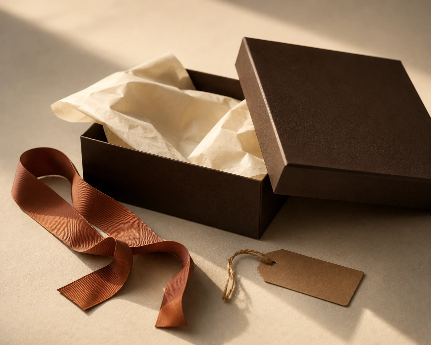
The same three colours carry into the unboxing, where the brand is doing its least defended work — nobody is browsing, they have already bought, and the only job left is to make the decision feel correct.
The box is unprinted apart from a blind-debossed mark. Terracotta appears once, on the ribbon, in the same disciplined way it appears once per screen.
Typography
The Interface
The product page is the whole business.
Most retail sites spend their design budget on the homepage and let the product page inherit a template. We inverted that — the product page got the most attention, because it's where the decision actually happens.
Bags / Travel
Canvas Weekender
£240
18oz dry-waxed cotton canvas, bridle leather handles, solid brass hardware. Made in Northampton.
Colour — Terracotta
Product detail — the single most-optimised template in the system
Mobile first, genuinely
Made tobe kept.
Wool Overshirt
Weekender
Canvas Weekender
£240
Checkout keeps the brand's type, colour, and spacing all the way to confirmation — the handoff that used to lose people.
The Build
Engineered so the design survives contact with content.
A design system only earns its keep if the people using it daily can't easily break it. We shipped tokens and components rather than screens, so a merchandiser adding a product on a Tuesday gets the same typography and spacing decisions we made in week four.
Design tokens
Colour, type scale, and spacing defined once and consumed by both the design files and the front end — no drift between them.
Component library
22 components covering every template. Merchandising teams compose pages; they don't invent layouts.
Performance budget
Responsive images, lazy loading below the fold, and a hard ceiling on third-party scripts agreed before build started.
Accessibility
WCAG AA contrast throughout, full keyboard path from listing to confirmation, and visible focus states designed rather than inherited.
The Result
A brand Lumen could carry from packaging to confirmation email without it changing shape.
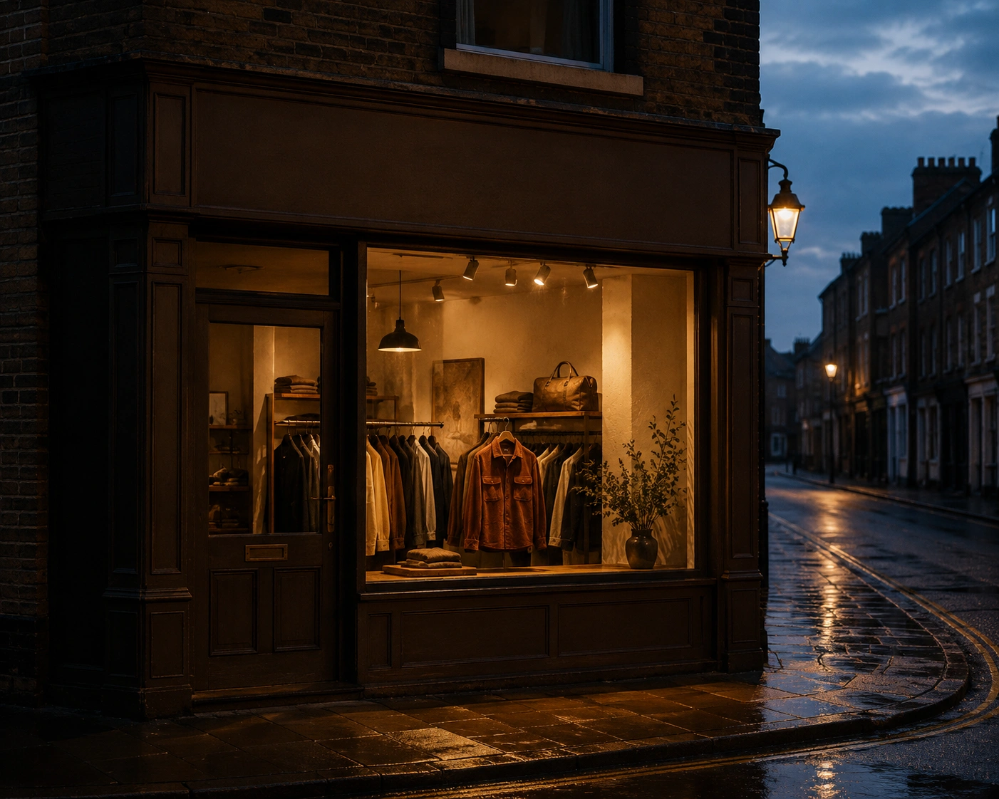
One system, everywhere
Brand, web, and commerce finally speaking the same visual language.
Built to extend
A token-driven foundation ready for new categories and markets.
Commerce that fits
Checkout designed as part of the brand rather than around it.
A note on numbers. Lumen is a concept project, so there's no live traffic behind it and we won't invent conversion figures. What's shown here is the design and engineering work itself — the part we'd actually be accountable for on a real engagement.